
Michelle+Anthony's Inspiring Space

Michelle and Anthony have a beautiful home in an even more beautiful location. When they were nearing the end of a major renovation of their main floor, they got in touch with me to help them furnish and finish their new spaces. I was more than happy to jump in!
Their family is full of hobbies—they paint, draw, play sports and multiple instruments, entertain friends, and are always, always reading. Their newly open plan kitchen, dining, and living rooms needed to be versatile, flexible, and inspiring to this busy group!
Here's the space mid-renovation, when I first got to see it:
And here's the design we came up with!


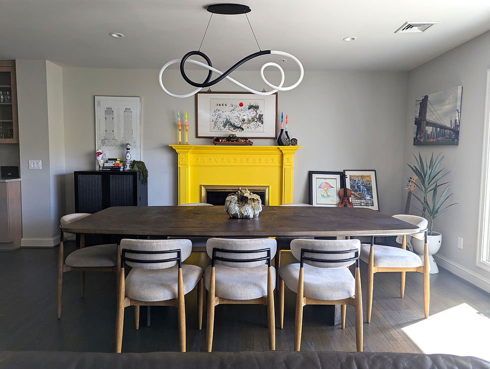
In the dining room, they wanted a way to incorporate the existing fireplace, which they'd decided not to redo as part of the renovation. We painted it a bright yellow that we echoed in the media stand at the other end of the room. A generous dining table and comfy chairs make long, lounging meals easy, while the frames in the corner allow for whatever the kids have been drawing lately to be swapped in and out.


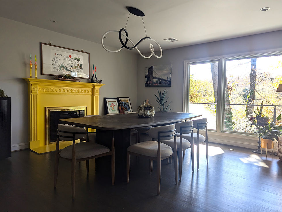

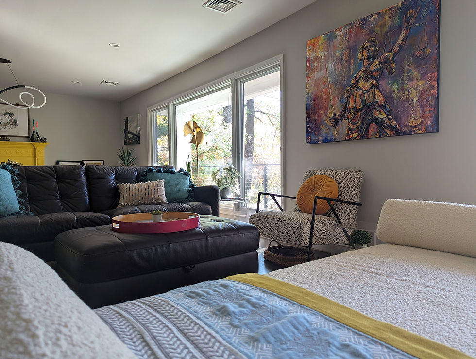
We brought in lots of plants to bridge the in/out divide, taking advantage of the view into the tree canopy out the window.


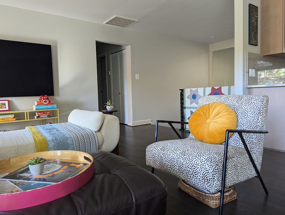
Personal details, like stacks of library books under the end table and a family heirloom quilt, bring such a special layer of interest to this vibrant and colorful room.


We've got more to come from this funky family home! See you next time.


Mình đang dọn kho và muốn đăng bán kệ trưng bày, máy in cùng đồ điện tử còn sử dụng tốt. Mình xem https://raovatdangtin.com/ vì nền tảng cho phép đăng tin, sản phẩm, liên kết và tạo gian hàng theo nhiều khu vực. Các tính năng quản lý đơn, chat, theo dõi và phân loại giúp mình gom thông tin bán hàng thay vì trả lời ở nhiều nhóm. Khi đăng, mình sẽ ghi rõ tình trạng, kích thước, lỗi, giá, địa điểm xem hàng và phương thức giao nhận, đồng thời dùng ảnh tự chụp. Vì nội dung do thành viên đưa lên, người mua nên kiểm tra hồ sơ người bán, ngày đăng và tính nhất quán trước khi…
Mình có kế hoạch đưa gia đình đi Hải Phòng nghỉ mát vào tuần sau nên xem trước https://thoitiethomnay.org/hai-phong/7-ngay-toi/ để chọn ngày đi phù hợp. Trang hiển thị dự báo theo từng ngày khá rõ ràng, giúp mình biết được ngày nào nắng đẹp thích hợp đi biển, ngày nào có khả năng mưa để tránh. Giao diện dễ theo dõi dù xem cùng lúc thông tin của cả tuần. Tốc độ tải nhanh, không mất nhiều thời gian chờ đợi. Nhờ xem trước như vậy mà chuyến đi lần này gia đình mình chọn được đúng ngày trời đẹp nhất trong tuần.
xx 88 so với mấy trang mình từng lướt trước đây thì nhìn đỡ rối hơn hẳn. Mình vào chỉ định xem thử họ sắp xếp bài vở thế nào thôi, ai ngờ kéo xuống thấy mấy khối nội dung đặt tiêu đề rõ ràng nên đọc lướt cũng bắt nhịp nhanh, kiểu mỗi đoạn nói đúng một ý chứ không nhồi chữ. Có bài kiểu “giải đáp 5 thắc mắc” dành cho người mới nhìn khá dễ theo dõi, nhất là đoạn nói về chuyện nạp rút trong ngày, viết thẳng và gọn nên mình đỡ phải ngồi tự đoán. Mình cũng để ý phần menu với các mục chính đặt ở chỗ dễ nhìn, bấm qua lại không…
https://xosoplus.mobi/ mình ghé thử vì thấy mọi người nhắc hoài, kiểu vào xem giao diện họ làm ra sao thôi. Vừa mở lên là thấy họ chia mục theo ngày khá dễ hiểu, có đoạn XSMB ngày 19/07/2026 rồi tách riêng phần dự đoán cho 20/7/2026 nên không bị lẫn lộn. Mình thích nhất là mấy khối số liệu trình bày gọn, đặc biệt bảng “Đầu Lô tô / Đuôi Lô tô” nhìn dạng cột rõ ràng, kéo xuống cái là bắt nhịp được luôn. Không phải kiểu nhồi chữ dày đặc, tiêu đề với nội dung tách ra rành mạch nên lướt trên điện thoại cũng ổn. Nói chung cảm giác bố cục đang “dẫn mắt” khá tốt, nhất…
GG88 mình mới lướt thử vì thấy bạn bè nhắc hoài, kiểu vào xem cho biết thôi chứ không định đọc kỹ. Ấn tượng đầu tiên là giao diện nhìn gọn gàng, tối giản mà vẫn hiện đại, không bị nhồi chữ nên đỡ mỏi mắt. Mình thích cái cảm giác mới vào đã biết nên nhìn chỗ nào trước, mấy mục chính đặt khá “đúng chỗ” nên bấm qua lại nhanh, không phải mò lâu. Kéo xuống một đoạn là thấy nội dung chia theo từng khối rõ ràng, nhìn phát nắm được bố cục luôn. Nói chung nó cho cảm giác thao tác mượt và dễ làm quen, nhất là cách họ nhóm danh mục khá khoa học…